
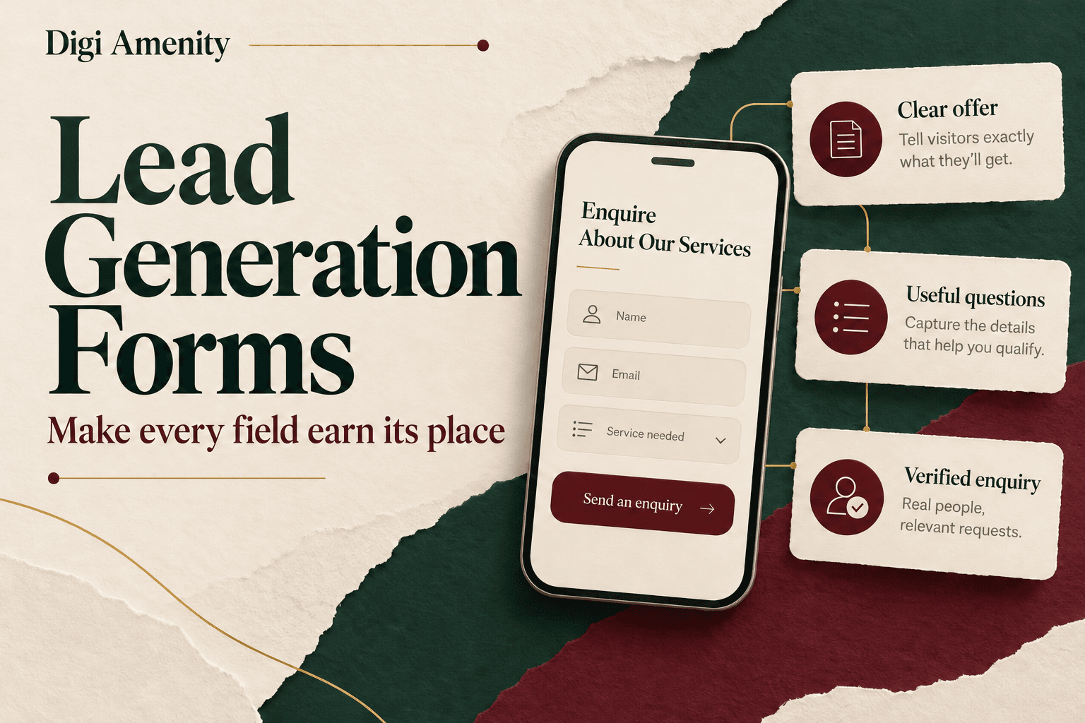
Lead generation form best practices start with five decisions: explain what the visitor will receive, ask only questions that support that request, make the form easy to complete on mobile, confirm that submissions reach your team, and measure qualified enquiries rather than button clicks. The shortest form is not automatically the most useful. A field earns its place when its answer changes how you fulfil, route or assess the enquiry.
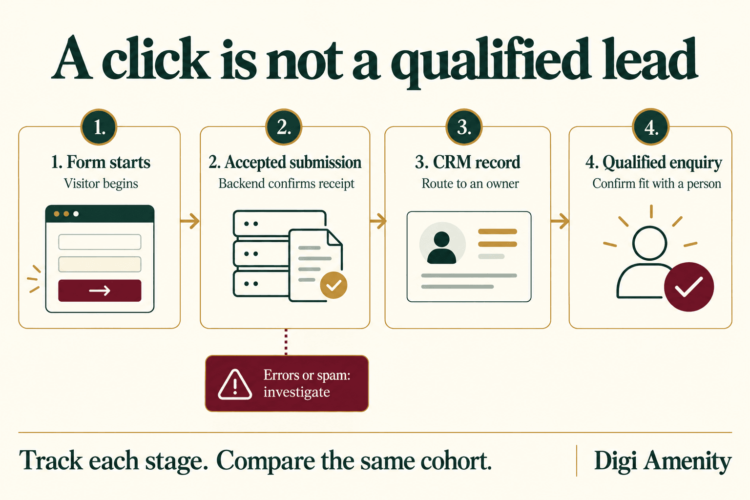
For an Indian service business, a form sits between the campaign promise and a sales conversation. An excellent Google Ads campaign can still send people to a confusing form. A polished website can collect enquiries that nobody follows up. Digi Amenity’s approach is to review that whole journey: traffic → offer → form → confirmed receipt → owner → qualified conversation.
What should your lead generation form actually achieve?
Start with the next action your visitor wants. Downloading a worksheet, requesting a quotation and asking for a callback require different information. Putting the same seven fields on every page usually means the business has designed around its database rather than the visitor’s task.
Write a one-sentence purpose before opening your form builder: “This form lets a facilities manager request an office-maintenance quotation and routes the enquiry to the team serving that property.” Now each proposed question has something concrete to justify.
Keep these outcomes separate:
- Subscriber: someone asked to receive content or updates.
- Enquiry: someone requested help, pricing or a conversation.
- Qualified enquiry: the request meets your agreed service, location and buying-context criteria after review.
- Customer: the agreed commercial outcome happened.
A content download should not silently become a request for repeated sales calls. If your problem is choosing the incentive itself, begin with the guide to lead magnets and offer strategy. The form should deliver that promise, not change it.
Which fields should you keep, remove or ask later?
Use this field-decision worksheet in a meeting with the person who handles enquiries. For every required question, ask: “What action becomes impossible or materially worse without this answer?” If nobody can name an action, remove the requirement or collect the detail later.
| Field | A reason to collect it now | When to defer or simplify |
|---|---|---|
| Name | Address a person naturally during follow-up. | One name field is often sufficient; avoid forcing separate middle-name details. |
| Deliver a requested asset or reply in writing. | Do not require a corporate domain unless it serves a real eligibility rule; some valid Indian businesses use personal email providers. | |
| Phone | The visitor explicitly requests a call. | For an emailed checklist, phone collection may be unnecessary. Explain the contact purpose beside the field. |
| Service needed | Route to the correct specialist. | Use a short, understandable list plus an appropriate unsure option; do not expose internal department codes. |
| Service location | Confirm whether you can serve the requested property or site. | Ask for city or postcode before a complete address if that is enough. The visitor’s current location may differ from the job location. |
| Budget or project size | Choose an appropriate scope or quote process. | Offer meaningful bands or “Need guidance” when buyers cannot estimate yet. Avoid treating uncertainty as automatic rejection. |
| Open message | Capture an unusual requirement. | Keep optional when a service choice already supports routing. Avoid requiring an essay on a phone. |
This is a starting framework, not a universal field limit. A newsletter subscription might need only an email address. A commercial installation quote may need contact details, service location and project type. The question is whether the extra work produces information someone actually uses.
W3C’s accessible forms guidance supports asking only for necessary information, giving controls meaningful labels and helping users understand instructions. Apply those principles before cosmetic changes.
Should you use a single-step form or a multi-step form?
Use a single step when the request is simple and visitors can understand the task at a glance. Consider several steps when questions naturally separate into project details, contact information and review. Splitting a long form does not remove unnecessary questions; it can simply hide the same effort behind a “Next” button.
For a multi-step form, show honest progress, let users go back without losing answers, and explain when the request is actually sent. Do not label the first button “Get my quote” if it merely opens another questionnaire. If answers change which questions are relevant, conditional fields can help—but test every branch and its validation rules.
Placement also depends on the offer. A familiar callback request can appear near the top of a service page. An unfamiliar or expensive service may need explanation and evidence first. A button that moves visitors to the form can reduce duplication on long pages. Keep a clear route to the form without covering the content with a persistent mobile overlay.
What makes mobile lead generation forms easier to complete?
A desktop preview is not enough. Review the full page, including cookie notices, sticky navigation, chat widgets and newsletter sections. A form can fit inside its own box while another page component creates horizontal scrolling.
As a practical QA range, inspect narrow phone widths such as 320, 360, 390 and 430 pixels, then check at least one actual phone. These widths are test cases, not a complete device-compatibility certification. Check the form with the keyboard open, after an error and after success—not just in its empty state.
- Keep labels visible: visitors should still know what a field means after they start typing.
- Choose suitable input behaviour: use appropriate email and phone fields and sensible autocomplete. Test how your chosen builder renders them.
- Avoid rigid phone formatting: legitimate numbers may include a country code, spaces or punctuation. Normalise deliberately instead of rejecting reasonable input without explanation.
- Keep controls reachable: labels, selection controls and the button need enough space to tap without hitting a neighbour.
- Check wrapping: long service names, privacy text and validation messages must fit without clipping.
- Test keyboard access: focus should move in a logical order, remain visible and reach every required control.
Do not solve overflow by hiding all off-screen content. That can conceal the button or part of an error. Identify the component that is too wide—often a fixed-width embed, excessive spacing or an inflexible row—and correct its layout.
How should validation, privacy and spam controls work?
Validation should help a suitable prospect complete the request. “Invalid input” gives little help. “Enter an email address such as name@example.com” explains the correction. Preserve valid answers when another field fails, and identify the affected field rather than making the visitor search for it.
W3C’s form notification tutorial recommends clear feedback for both errors and successful completion. Error feedback should explain how to recover; success should confirm that the task finished. Do not rely on a red border alone.
For privacy, explain what will happen to the submitted information, provide an accessible privacy-policy link and distinguish the requested service response from optional promotional subscriptions. Keep optional choices clear. This is a product-design recommendation, not a claim that a particular checkbox makes a business legally compliant; the notice and permissions must match the actual processing.
Protect against abuse with server-side validation and proportionate controls. Depending on your platform, options may include rate limits, a honeypot, challenge checks and moderation. Choose and test them with your developer. A challenge that never loads, or a hidden field that catches legitimate assistive-technology users, can damage the enquiry path. Monitor rejected submissions as well as accepted ones.
Do not ask for identity documents, detailed medical information or other sensitive material merely to qualify a general marketing enquiry. When a later service stage needs such information, use an appropriately designed process for that purpose.
What should happen after someone presses the button?
The interface should show success only after the system accepts the request. Then it should explain the next step: a confirmation email, a response during stated working hours or a link to the requested resource. Promise a response time your team can meet, including weekends and holidays.
For a hypothetical service business, a useful confirmation might read: “Your quotation request has been received. Our service team will email you during the next working day to confirm location and scope.” Use that wording only if the actual operating process supports it.
Give each accepted request a stable internal reference. Check that the record reaches the intended CRM or enquiry store and has an owner. If an integration fails, retain the original request safely and alert the team. Retrying delivery should update or recognise the same request rather than create multiple sales records.
Test the complete chain with clearly marked test data in a staging or authorised test environment: submit, inspect receipt, verify the CRM record, check routing, inspect the acknowledgement and confirm that test leads are excluded from business reporting. Seeing a thank-you screen alone does not prove that the sales team received anything.
How should form conversion tracking work in GA4 and your CRM?
Google Analytics enhanced measurement includes form_start and form_submit. Google defines the former as the first interaction with a form in a session and the latter as a submission. They are useful signals, but you still need to validate their behaviour against your actual form. See the official enhanced measurement definitions.
Separately, Google defines generate_lead for a generated lead and qualify_lead for one meeting qualification criteria. These are different stages in its recommended events reference. Choosing an event name does not implement the trigger or prove the lead is genuine.
For an enquiry form, define your intended success trigger around confirmed acceptance, then reconcile it with backend records. Check failed validation, repeated clicks, page refreshes and integration retries. Avoid sending the same event from a plugin and a tag-manager rule unless the implementation explicitly prevents duplicate counting.
Keep names, email addresses, telephone numbers and free-text enquiry content out of ordinary analytics events and URLs. Google’s PII guidance explains this restriction. Use non-personal classifications such as form version, service category and error type where appropriate; keep contact records in the authorised business system.
For analysis, choose one unit and preserve it. If your denominator is unique sessions that started a particular form, use sessions with at least one accepted submission from that same population as the numerator. Do not divide CRM records by an unrelated count of analytics users and call it a form completion rate. Consent, blocked measurement and different reporting windows can also create coverage differences.
| Measure | Definition for this audit | What it helps diagnose |
|---|---|---|
| Observed form completion rate | Started sessions with an accepted submission ÷ observed started sessions, same form and period | Friction between starting and confirmed completion |
| CRM delivery rate | Unique accepted requests successfully delivered to the CRM ÷ unique accepted requests | Broken handoffs and missing records |
| Qualification rate | Confirmed qualified enquiries ÷ unique valid enquiries in a defined cohort after a stated review window | Offer, audience and service fit; keep pending cases visible |
| Cost per qualified enquiry | Defined campaign spend ÷ confirmed qualified enquiries attributed to that cohort | Whether cheaper submissions actually create better economics |
When the denominator is zero or the required data is missing, report the measure as unavailable with the reason. Do not replace it with zero. Agree whether “spend” means media only or includes production and agency costs before comparing campaigns.
What does a useful form experiment look like?
Hypothetical example—not a Digi Amenity client result: an Indian office-maintenance company tests whether asking for service location helps its team avoid enquiries outside its coverage. Both variants explain the same service and promise the same follow-up. The team uses the same qualification criteria and allows the same time for sales review.
| Illustrative result | Form A | Form B |
|---|---|---|
| Media spend | ₹20,000 | ₹20,000 |
| Unique valid enquiries | 100 | 80 |
| Confirmed qualified enquiries | 20 | 32 |
| Cost per valid enquiry | ₹200 | ₹250 |
| Qualification rate, all enquiries reviewed | 20% | 40% |
| Cost per qualified enquiry | ₹1,000 | ₹625 |
In these invented numbers, Form B produces fewer enquiries and a higher cost per enquiry, but a lower cost per qualified enquiry. That is why total submissions alone cannot select the winner. The example illustrates arithmetic; it does not establish statistical significance, revenue improvement or a guaranteed benefit from adding location.
In a real test, define the hypothesis, main metric, guardrails and stopping rule before launch. Keep traffic allocation and eligibility comparable, document changes in offers or campaigns, and allow enough time for qualification. For low traffic, correct obvious usability failures first and collect evidence over a longer period; a few conversions cannot settle a subtle design question.
When enquiry quality remains poor despite a working form, review the search terms, ad promise, service coverage and sales response. The Google Ads lead-quality guide explains those upstream and downstream checks.
Which lead generation form best practices should you check before launch?
Assign an owner and evidence to each item below. “Looks fine” is not an acceptance test.
- Promise: the page, form heading, button and acknowledgement describe the same request.
- Fields: each required question has a documented fulfilment, routing or qualification purpose.
- Mobile: the full page fits narrow screens; the keyboard, sticky elements and expanded errors do not hide controls.
- Accessibility: labels, focus order, required-state instructions and error recovery work with keyboard and assistive-technology checks.
- Validation: ordinary valid inputs pass; incomplete and malformed inputs produce helpful feedback without losing other answers.
- Failure handling: network or integration failure cannot create a false success; retained requests can be investigated safely.
- Delivery: an authorised test request reaches the correct owner with the necessary context.
- Duplication: refreshes, repeated clicks and retries do not inflate records or conversion events.
- Measurement: success triggers, cohort definitions, test exclusions and qualified-lead criteria are documented.
- Follow-up: response ownership, operating hours, escalation and pending statuses are visible to the team.
Review the same checklist after changing the theme, form plugin, CRM integration or consent setup. A form that worked at launch can break when another part of the website changes.
Frequently asked questions
How many fields should a lead generation form have?
Use the minimum needed to fulfil the specific request and route it correctly. An email subscription and a complex quotation should not share a fixed field target. Document the decision each field supports, then test the effect on qualified enquiries and completion.
Should a phone number be compulsory?
It can be appropriate when a visitor requests a callback or the service genuinely requires phone coordination. For an emailed resource, it may add unnecessary effort. Explain why you need it and provide a suitable alternative contact route where your service allows one.
Are multi-step forms better for conversions?
They can make complex questions easier to understand, but they also introduce navigation and state-handling requirements. Compare like-for-like requests, preserve answers when people go back and measure confirmed completion. Splitting the same unnecessary questions into steps is not an improvement by itself.
What is a good lead form conversion rate?
There is no universal target that covers cold ads, existing customers, free resources and high-value quotations. First define whether you mean visitors, form viewers or form starters. Compare your own equivalent audiences and offers, while checking qualification, delivery failures and sales outcomes.
Can GA4 automatically tell me how many genuine leads I received?
Automatic form-interaction events can show activity, but genuine receipt and qualification require validated implementation and business review. Reconcile accepted submissions with your enquiry system, exclude tests and duplicates, and keep qualified outcomes separate from raw form activity.
Should I remove spam protection to get more submissions?
Do not remove controls simply to raise a dashboard total. Investigate false rejections and inaccessible challenges, then adjust the implementation with your developer. Track accepted, rejected and valid enquiries so a rise in spam is not mistaken for growth.
Why are people submitting forms but not becoming customers?
Check fit, contactability, offer expectations and the speed and usefulness of follow-up. Also confirm that records reach an owner. A form can collect accurate details from people who want a different service or are not ready to buy; fixing the form alone will not resolve those mismatches.
Need help finding where enquiries are being lost?
If your campaigns generate form submissions but few useful conversations, Digi Amenity can review the offer, mobile form, success tracking and CRM handoff before you increase traffic. Start with a website and landing-page review focused on the point where the enquiry journey breaks.
